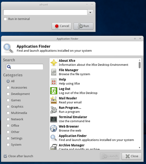
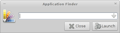
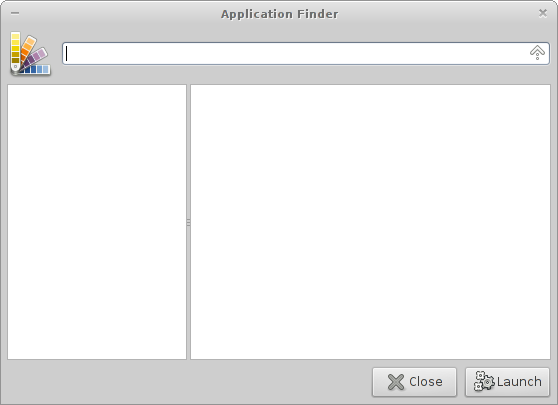
Xfce4-appfinder
You can read all about the merge planned for 4.10 here.
For Reference: Old Interfaces of xfce4-appfinder and xfrun4
Initial Idea
His is how I had it in mind first. — Nick Schermer 2011/05/29 23:21
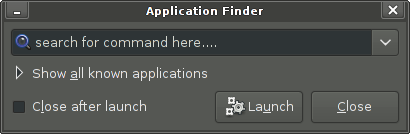
Collapsed version, like xfrun4.
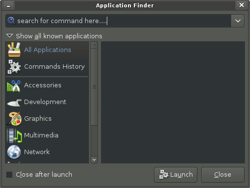
Expanded like xfce4-appfinder.
Comments
- Should the compact mode be a standard-compliant dialog or are you open to making it more minimal/elegant (obviously this would come at a certain cost)? I can provide mockups of course, but I was thinking of less elements, mostly just the searchbox and a launch-button. (“Cancel” or “close” is in the wm-controls of most people anyway.) Maybe not as extreme as gnome-do or comparable launchers, but that'd be the direction. — Simon Steinbeiß 2011/05/30 00:52
- I'm open to suggestions, however I'd prefer to use the “expected” widgets to not confuse people. The “Close after launch” checkbox won't be visible in the collapsed view. The expander, well, not sure we can get rid of that, could be a button too. — Nick Schermer 2011/05/30 07:49
- I propose to drop the “Close after launch” button entirely. I cannot imagine many situations where people would want to keep it open. So I think we can omit that option. Perhaps add a hidden option for that feature but no more than that. — Jannis Pohlmann 2011/05/31 17:22
- I was thinking since the dropdown shows the history, it could be used instead of the expander to show the extended mode with history focused (instead of showing an actual dropdown). If that's impossible I'd vote for something like a more subtle togglebutton. I'll see whether I can come up with a decent mockup. — Simon Steinbeiß 2011/05/31 01:26
- Completion including rich text and icons can be done using GtkEntryCompletion with a GtkListStore combined with any cell renderers. — Christian Dywan 2011/05/31 03:19
- Might we please have tab completion? Thank you. — Amir Dizdarević 2011/11/27 10:55
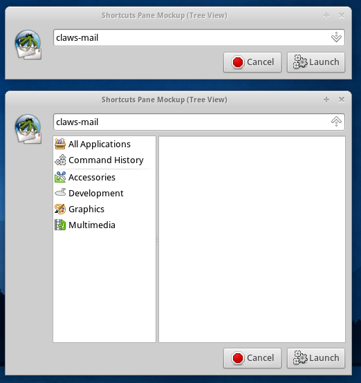
Compact Mockup

Rationale: when auto-completing a command appfinder could show the icon of the application the user is about to launch. The idea of dropping the expander in favor of the dropdown is also integrated in this mockup. — Simon Steinbeiß 2011/05/31 04:20
Comments
- How exactly does this interface switch to the expanded/finder mode? The down-arrow in the entry normally shows the last 10 commands entered. — Nick Schermer 2011/05/31 12:54
- Is “last 10 commands” the same as “History”? In that case history could be pre-selected after expanding by clicking on the down-array button, like Simon suggested in one of his earlier comments. Not sure if that wouldn't be too unusual though. — Jannis Pohlmann 2011/05/31 13:31
- I don't think we can replace the expander with the drop down array in the entry. I mean, technically that can work but the completion alternatives are also important. How about the idea where the expander is replaced with a toggle button on the left that aligns better with the cancel/run buttons? — Jannis Pohlmann 2011/05/31 13:28
- Well completion and history are kinda exclusive. Either you type something into the entry and get completion or you hit the arrow and get the history. That's even how xfrun works now. I thought about the toggle button for a while too, but I can't really decide what icon would fit. If it were text-only it could be something like “More” or “Show…”. A simple arrow_down could look a bit clumsy on a toggle (but I agree that a toggle would align more nicely than an expander). — Simon Steinbeiß 2011/05/31 13:57
Error handling mockups
1  2
2 
3 
Comments
- I thought up a few options on what could happen when a user enters a command that doesn't work. After having looked at all of them for a short while now I'm wondering whether just changing the icon to “gtk-cancel” (or something similar) would be sufficient. The error-label looks rather weird and messy and I'm not even sure that the second mockup is technically possible. What could work though is maybe flashing the red bg-color from mockup1 once or twice to give the user some immediate feedback. — Simon Steinbeiß 2011/06/03 10:41
- I would prefer not to use colors too extensively. If the colors used are configurable, ok, but even that is something theme authors have to do first. Quite often colors like red or green don't fit in with themes well. Also, Also, red vs. green is something that doesn't work well for many people (same with blue vs. yellow except that there are fewer people affected by that combination). An error icon is good and flashing the background or the entry shadow (that's possible, I've done it in xfce4-verve-plugin) a few times might work as well. — Jannis Pohlmann 2011/06/04 00:19
- another idea: clicking the icon could actually do something in this case, e.g. add some vertical space between the entry and the buttons with a label saying “command not found”. — Simon Steinbeiß 2011/06/03 12:16
- I would prefer not to introduce new UI paradigms that people are unfamiliar with. An error icon is something that people are not used to clicking on. — Jannis Pohlmann 2011/06/04 00:19
- I think idea 3 can be dropped. The limited space to the left of the buttons is everything but a nice location to place text messages. — Jannis Pohlmann 2011/06/04 00:25
- Why not just make the 'Launch' button grayed out and unclickable until the input is valid? Sorry to randomly comment like this; I found this discussion interesting. — John Vilk 2011/06/27 22:51
Compact Mode (Expanded)
This is a mockup based on real code that demonstrates the idea of using the down/up button in the entry to expand the view. The question is: How would completions be handled in the expanded view? Would they be dropped? — Jannis Pohlmann 2011/05/31 15:53
Comments
- Not sure if we should hide the completion in expanded view. I guess we have to try it first, see if it feels natural. I think we should also skip the history popup menu, like we have it now in xfrun4, and expect users to use the expanded view for that.
That said I really like the design. Maybe we can use the space below the icon for the category list as well, but it looks clean and usable for sure. — Nick Schermer 2011/05/31 16:24
- There is a problem with the up/down key : if you do two times down you are going in the expanded view, but now you cannot do up again to be in the reduced view (you have to do 2x Shift-Tab, and then Up. Concerning the history popup menu, I think it is a bad idea to remove it (this is what I use most). — Amic 2012/02/22 17:03
C demo-code in GIT
Center the entry with the icon, but keep 6px space between the entry and the buttons.
Expanded layout with 6px between the icon and the treeview, entry still center-aligned with the icon.
Ideas
- Primary icon in the entry used for error icon if launching failed, icon tooltip can show the full error message. — Nick Schermer 2011/05/31 22:55
- Is there something like a default color for the entry on error? (I mean e.g. recoloring the highlight or bg-color of the entrybox red when a user enters a non-working command.) — Simon Steinbeiß 2011/06/01 10:42
- There is no color for that in the style, however we can make a special style name for that, that is set for 1 second or so. — Nick Schermer 2011/06/01 10:47
- One more note on the error-handling behavior: I personally think the appfinder shouldn't close itself when a non-working command is entered. Even this alone can be good feedback for the user that something is wrong/not working on his/her side. — Simon Steinbeiß 2011/06/03 10:46
- Agreed, it should not close on error. — Jannis Pohlmann 2011/06/04 00:17
- A bit off-topic, but I am not sure that appfinder is the right name for this tool. I mean that it is going to be more than an application-finder, it will actually execute any command you want while helping you find it if you don't know. Merging xfce4-appfinder and xfrun will get you a new beast entirely. Doesn't that warrant a new name? — Stephan Arts 2011/08/18 13:14
Extensions

Picked that idea up from the roadmap page, when entering a webadress the icon will change to the default browser obviously (same thing could happen for email-addresses). So far this seems pretty obvious and easy, it'll get more challenging (in the minimal mode) when e.g. a webaddress would target more than one application: alternative browser, web-services etc. — Simon Steinbeiß 2011/06/03 10:54
- Picking the idea up from error-handling, the appicon could be clickable (should prelight like a button on hover) and give a drop-down of alternative browsers/services for webaddress (sticking to the example from above). — Simon Steinbeiß 2011/06/03 12:17
- We always use the default web browser. I am not sure we want to integrate something like “Open With” in the appfinder. Probably not. — Jannis Pohlmann 2011/06/04 00:17
- I actually like the idea. — Stephan Arts 2011/08/18 13:26
Panel Plugin
A button, which looks like the Applications Menu button and toggles visibility of an AppFinder widget.
The AppFinder widget is displayed next to the panel (like applications menu), without window borders and without “Preferences”, “Close”, “Launch” buttons. Optionally it has an additional padding.
AppFinder preferences are available through a plugin context menu. AppFinder plugin preferences (icon, visibility of a label etc.) are also available through the context menu. (a separate dialog?)
Implementation
Implementation Constraints
- To save memory the panel applet shares the model (app data) with the xfce4-appfinder process (if any). Possible solution:
- The plugin requests opening the widget over DBUS.
- The widget is rendered by the xfce4-appfinder process.
- The widget is embedded in a widget opened by the plugin in order to add some padding, hide the widget etc.
- (alternative) The widget is not embedded and its position and visibility is controlled over DBUS.
- The panel plugin is shipped with AppFinder (building and installation should be optional and enabled by default).
Comments
- I don't see what makes this easier then popping up the window. I feel more for a verve-like launcher for this. — Nick Schermer 2012/02/07 14:13
- Well I think it's mostly about the look'n'feel of traditional appmenus like Windows used to promote them (but it seems they're perishing anyway). About the verve-idea: I don't see what makes it easier to put keyboard-focus into a panel-plugin than to hit a keyboard-combo to launch appfinder ;) No, seriously, I think “power-users” don't need any of that. The straight-forward appfinder would be enough for them. It might still be worth to do such a plugin if it's not too much effort. — Simon Steinbeiß 2012/02/07 14:38
- Answering the “why” question: think of it as of a better (at least for some users) applications menu. It can be bound to a key but it is still useful to have it in the panel - if only for discoverability for new users (just like the menu). Besides, “why _not_”?, appfinder is here and is pretty good, why not expose it a bit more. — Andrzej 2012/02/07 18:27
- Two observations related the dbus support in appfinder: 1) xfce4-appfinder doesn't install a .service file, 2) it doesn't have a –daemon command line option for starting only the service (without showing a window). — Andrzej 2012/02/07 18:51