Table of Contents
Thunar: Improvement of the Window Layout (Completed)
A project brought to you by the Xfce Design SIG. Completed in May 2011.
Description
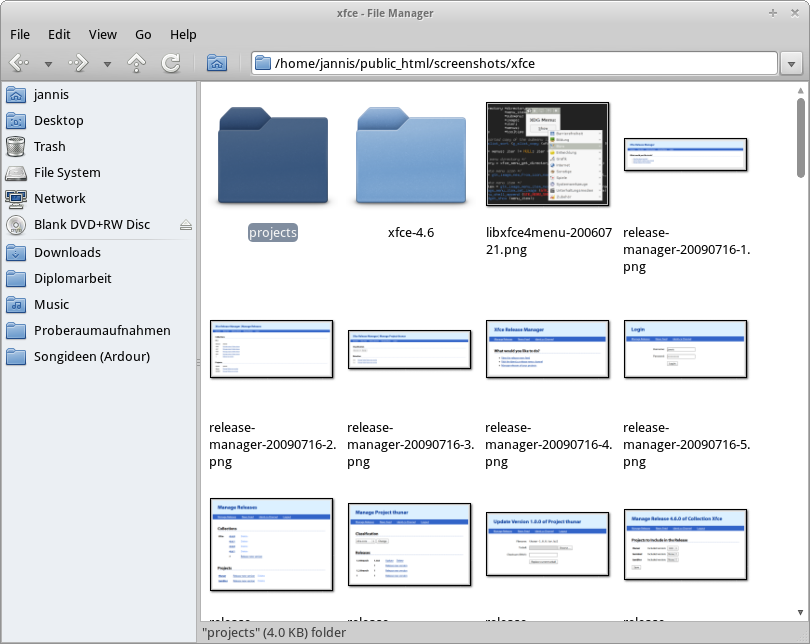
Traditionally, Thunar has always used several pixels of padding around its main window content. The status bar used to span the entire width of the window. Simon proposed to change this so that the main window would waste less space and would look more appealing.

