Thunar: Redesign of the Shortcuts Pane
A project brought to you by the Xfce Design SIG.
Old ideas and discussions can be read in the page history.
Description
Thunar offers two different side panes, a directory tree and a side pane with shortcuts, called the shortcuts pane. The shortcuts pane was not updated in Thunar 1.2 despite the functionality added by GIO, such as the availability to mount archives or browse remote locations. A straight-forward way to extend the current shortcuts pane would be to simply add the new items into the flat list that is shown under Current Design. However, we felt that we can do better and we are looking for suggestions on how to improve the current design to a) integrate the new features and b) look more appealing.
Git repository for test-code
Current Design
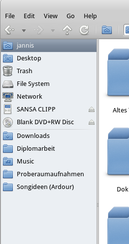
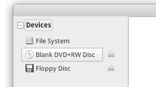
Here are two screenshots of the current user interface of Thunar. The second shot is a good example of how cluttered the side pane looks as soon as more devices are attached to the computer:
Problems / Comments
- Mounted items like archives, remote locations and Samba shares are not integrated or shown at all. If we simply add them to the flat list of items in the current shortcuts pane, it will be increasingly hard to tell what is a personal folder, what is a volume, what is an archive etc. So I think grouping items by category (whatever “category” means here) might be necessary. But that is just one possible approach of many, I guess. — Jannis Pohlmann 2011/05/26 17:20
- Grouping and making the groups/categories collapsible surely helps, but I think keeping categories down not to produce a category-overflow is an important point. — Simon Steinbeiß 2011/05/27 01:13
New Design
Categories in the Shortcuts Pane
Here's our list of categories, we still have to settle on what comes first (“network” comes last):
- Devices (shows internal partitions and external devices; internal partitions can be hidden)
- Places (shows xdg-user-dirs and bookmarks)
- Network (shows remote bookmarks and samba-shares)
Mockups
Quick Mockup of an Early Custom Button Idea
Comments
- This would require a custom button class to be written but we could probably take most of the rendering and shading code from GTK+ and even re-use existing style properties so that themes are not broken (I am not 100% sure here but I think so). Downside: This button looks like it will pop up a menu. And it is not clear that there are actually two separate things you can click on. — Jannis Pohlmann 2011/05/29 00:47
Early Glade Mockup Using Buttons and Expanders
Comments
- I like the position of the expander and the expander itself. The highlighting as a button should only happen when hovering the eject-icon, not the device-name since clicking doesn't really execute a button-like action.
- I would vote for that too, it feels less cluttered on hover IMO. Instead, when hovering the label we could change the mouse cursor as when hovering a link, change the background color or font (make it bold?)… — Jérôme Guelfucci 2011/05/29 15:25
- On second thought I'm really wondering whether we need highlighting for the nodes themselves, the eject button definitely needs something. But since the nodes aren't really like links (even though I agree you could argue the opposite here as well) I think the hand is misleading. To me they're more like folders and folders don't need/have much prelight. — Simon Steinbeiß 2011/05/30 01:35
Mockup After Initial Discussions
Comments
- I tried to implement this using a tree view. It's a pain in particular if the rows and their action buttons are to be interacted with independently. It's barely doable. Example code is here: http://git.xfce.org/special-interest-groups/design/tree/thunar/shortcuts-pane/demo-code/tree-view — Jannis Pohlmann 2011/05/31 04:31
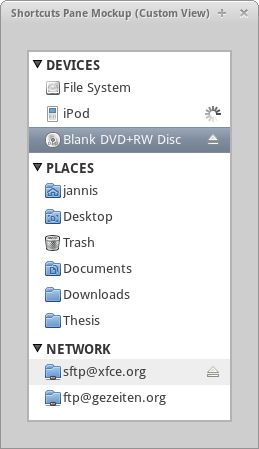
Implemented Mockup using Expanders and a Custom Row Widget
Comments
- This is an implementation using three expanders and a custom container widget for rendering a single row. The row and the action button can be focused/activated independently (even with a keyboard they are easy to navigate). All custom drawing is done based on primitives provided by GTK+, so that theming should not be an issue. The action button can switch between an eject icon, an animated spinner as a progress indicator and a cancel icon when the progress indicator is hovered with the mouse. Compared to the tree view idea it works much better and is easier to implement. Code is here: http://git.xfce.org/special-interest-groups/design/tree/thunar/shortcuts-pane/demo-code/custom-view — Jannis Pohlmann 2011/05/31 04:31
Summarized Requirements List and Implementation Status
The following criteria were identified as necessary and/or desirable for the new design of the shortcuts pane. The IDs are prefixed with A for Appearance, B for Behavior and I for Implementation. The discussions about these criteria can be read in the page history.
The status cells are color coded:
- a white background means the feature is not implemented yet,
- a green background means the feature is supported,
- a orange background means the feature is being worked on,
- a grey background means the feature is partially working but is not developed any further.
| ID | Description | Mockup custom-view | Thunar |
| A01 | Categories have a down array and can be expanded | @palegreen: Yes | @palegreen: Yes |
| A02 | Items are left-aligned with category titles | – (only fixed indentation at the moment) | @palegreen: Yes |
| A03 | Items have an icon, an ellipsized title and an action area with a button | @palegreen: Yes | @palegreen: Yes |
| A04 | Items have uniform size (height in particular) | @palegreen: Yes | @palegreen: Yes |
| A05 | Items are highlighted on hover | @palegreen: Yes | @palegreen: Yes |
| A06 | Items and action buttons are highlighted independently depending on the mouse position | @palegreen: Yes | @palegreen: Yes |
| A07 | The padding of the view can be configured by the theme | – | – |
| A08 | The background color of the view can be configured by the theme | @palegreen: Yes | @palegreen: Yes |
| B01 | Categories can be expanded with mouse and keyboard | @palegreen: Yes | @palegreen: Yes |
| B02 | Categories are not selected/focused when clicked/double-clicked with the mouse | @palegreen: Yes | @palegreen: Yes |
| B03 | Categories can be cycled through with the keyboard | @palegreen: Yes (tab key) | @palegreen: Yes (tab key) |
| B04 | Categories are expanded with a single click | @palegreen: Yes | @palegreen: Yes |
| B05 | Items can be navigated with keyboard and mouse | @palegreen: Yes (arrow keys) | @palegreen: Yes (arrow keys) |
| B06 | Items and action buttons can be focused/activated independently | @palegreen: Yes | @palegreen: Yes |
| B07 | Items and action buttons are selected/focused/activated with a single click | @palegreen: Yes | @palegreen: Yes |
| B08 | Activating an item replaces its action button icon with a spinner until it is mounted and loaded | – | @palegreen: Yes |
| B09 | Activating an action button replaces its icon with a spinner until the eject operation is finished | @palegreen: Yes | @palegreen: Yes |
| B10 | Dragging a URI to empty area or a category title opens a free spot in the category it belongs to | @lightgrey: Partly | – |
| B11 | Dragging a URI to an item works just like with dragging to folders in Thunar | – | @palegreen: Yes |
| B12 | Dropping a URI on empty area or a category title creates a bookmark in the correct category | – | – |
| B13 | Dropping a URI on an item copies/moves/links the URI into the corresponding folder or mount point. The selection/focus is not changed | – | @palegreen: Yes |
| B14 | Categories/items remain selected when unfocusing the Thunar window | – | @palegreen: Yes |
| B15 | Right-clicking the empty area displays a context menu | – | – |
| B16 | The empty area context menu has an item to edit the items in the shortcuts pane | – | – |
| B16 | Right-clicking a category title displays a context menu | – | @palegreen: Yes |
| B17 | The category context menu has an item to hide the category | – | – |
| B18 | The category context menu has an visibility check box item for each item available in the category | – | @orange: Yes (not saved yet) |
| B19 | Right-clicking an item displays a context menu | – | @palegreen: Yes |
| B20 | The item context menu has an item to mount the item if not mounted yet | – | @palegreen: Yes |
| B21 | The item context menu has an item to unmount the item if mounted | – | @palegreen: Yes |
| B22 | The item context menu has an item to safely remove (or disconnect) the corresponding device if there is one | – | @palegreen: Yes |
| B23 | If a new mount or volume becomes available and the corresponding category is collapsed, its header flashes a few times (e.g. by changing the background color) | – | @palegreen: Yes |
| B24 | Dragging a URI to the empty area or a category title with the right mouse button pops up a context menu where the user can choose between a temporary and permanent bookmark in the category | – | – |
| B25 | Dragging an item to a different location reorders the items in a category | – | @orange: Yes (not saved yet) |
| B26 | The DEVICES category displays system volumes (hidden by default), removable volumes and mounted archives | – | @orange: Yes (system volumes not hidden yet) |
| B27 | The PLACES category displays the home, desktop and trash directories plus XDG user dirs plus local URIs from ~/.gtk-bookmarks | – | @orange: Yes (XDG user dirs not included yet) |
| B28 | The NETWORK category displays all remote URIs from ~/.gtk-bookmarks and all mounted remote locations | – | @palegreen: Yes |
| B29 | Items are selected whenever the corresponding folder is opened in folder view | – | @palegreen: Yes |
| I01 | Categories and items are stored in an implementation of GtkTreeModel | – | @palegreen: Yes |
| I02 | Expanders and a custom row widget are used instead of a GtkTreeView | @palegreen: Yes | @palegreen: Yes |
Comments
- B20: Firstly, this would pollute the context-menu. Secondly (and more importantly) this is not a very good option for a context-menu, because you can only hide the item, not unhide it from there. I think in terms of consistency for the user (meaning: “Where do I change this or that behavior?”) one place to hide and unhide is better (e.g. the thunar preferences-dialog). Other stuff like making an item non-/persistent makes more sense, simply because the item doesn't disappear as a result of setting that option. — Simon Steinbeiß 2011/06/06 16:53
- True, I removed it from the list (so B20 now refers to something else). — Jannis Pohlmann 2011/09/07 02:01
Implementation Notes
- We need to distinguish various types of files, mounts and volumes:
- local (or regular) files that are not associated with a mount
- remote files that are optionally associated with a mount (this is the case with remote bookmarks; as soon as they are mounted, a mount will be created and we need to attach it to the shortcut)
- mounts that are not associated with a volume (this is the case with mounts of remote bookmarks, mounted archives and samba shares; mounts of remote bookmarks need to be attachd to remote bookmark shortcuts, others need to be displayed as a stand-alone shortcut either in the devices or network category)
- mounts that are associated with a volume (these should be ignored)
- volumes that have a mount and for which pressing eject should only unmount/eject that mount (these are USB sticks etc.)
- volumes that have a mount and for which pressing eject should eject the entire device (these are CD drives etc.)
References
Nautilus: Mockup from 2008
Comments
- The mockup looks very similar to the design of Finder. It's clean and different items are easy to distinguish. I can see two problems with this design: 1. it might not scale very well (e.g. imagine you had ~10 devices like in the old screenshot) and 2. it has no eject buttons (I would assume those to appear as sub-buttons once an item is hovered but other ways are possible). — Jannis Pohlmann 2011/05/26 19:05
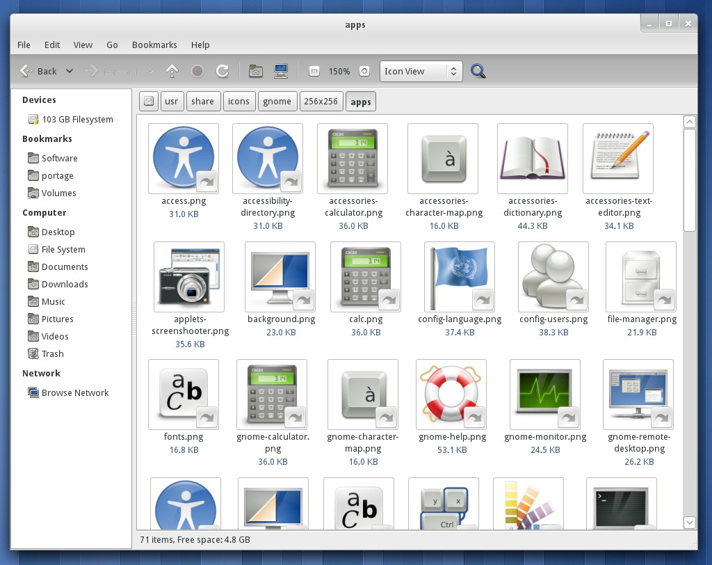
Nautilus: Current Design (GNOME 3, 2011)
Comments
OS X Finder
Sources: http://osxhelp.com/customizing-the-finder-sidebar-in-os-x/ http://www.macwize.com/HOWTO/files/application_installation.html
Comments
- I really like the editing feature. We should have that. — Jannis Pohlmann 2011/05/27 01:09
- Maybe it'd be enough to be able to show/hide categories, not each individual node (otherwise thunar would have to remember e.g. external devices as well in order to hide them again next time). — Simon Steinbeiß 2011/05/27 23:17
- Archives or iso-images make sense as part of the devices, if the feature lands in thunar, I guess this is how it should look/work — Simon Steinbeiß 2011/05/27 01:21


