User Accounts
We need a decent interface to manager user accounts. For this we will use the accountservice package.
It should be possible to add and remove accounts and edit the following settings: name, real name, password, automatic login, user picture and language.
First drafts
After evaluating a few user-settings-dialogs (e.g. users-admin) I came up with this first mockup:
 A few things that still bother me about it:
- The avatar feels natural in the right top, but leaves a lot of empty space on its left
- Suggestion: move the “Personal Details” title down so that it bottom-aligns with the avatar and is close to the actual fields. — Jannis Pohlmann 2011/11/27 14:23
- Nice idea, I'll try that and update the mockup accordingly. — Simon Steinbeiß 2011/11/27 14:27
- The userlist-add and -remove buttons could maybe just be small “+” and “-” buttons instead of the fat ones
- The edit-icons for the username and realname should be sitting on gtk-buttons
- Why not make it a GtkEntry readable by default, with an edit icon placed on the right side (gtk_entry_set_icon) that toggles the field readable/writable — Mike Massonnet 2011/11/27 10:31
- I like that idea, it's simple. — Jannis Pohlmann 2011/11/27 14:23
- Seconded. That makes a lot more sense. — Simon Steinbeiß 2011/11/27 14:27
- the positioning isn't perfect yet
- “Userlist” is not an English word, AFAIK. I think it should really be “Users”. — Jannis Pohlmann 2011/11/27 14:23
- Yeah, I had that there before. I agree that it should at least be changed to “User list” or simply reverted to “Users”. — Simon Steinbeiß 2011/11/27 14:27
Feedback is appreciated! — Simon Steinbeiß 2011/11/26 23:23
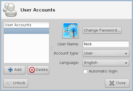
Nick's Idea
Attempt 1
- I like how the avatar and the user's real name are grouped — Simon Steinbeiß 2011/11/27 16:12
- Is changing the account-type part of the accountservice-package? (if yes, maybe complete the list of features/settings in the specification above) — Simon Steinbeiß 2011/11/27 16:12
- Yes, but only when authenticated (Unlocked), see act-user.h for the API. — Nick Schermer 2011/11/28 10:36
- Password: “Change Password…” seems like a duplication, either dropping the label or renaming the button to “Change…” would resolve this — Simon Steinbeiß 2011/11/27 16:12
- Yes a single button is indeed better. — Nick Schermer 2011/11/28 10:36
- We can also move the password button next to the picture settings, like Mac OS X has.
Attempt 2
Reworked first draft
Responding to a few ideas/questions posed above, I reworked the first draft:

Open Issues:
- Dropped the username-changing (do we really want people to do that?) — Simon Steinbeiß 2011/11/27 16:14
- Label on top of a GtkEntry: inconsistent with other settings-dialogs (labels are always on the left) — Simon Steinbeiß 2011/11/27 16:14
- Quite a bit of whitespace on the right bottom — Simon Steinbeiß 2011/11/27 16:14

