Review of current Xfwm4 decorations vs. CSD
Code: https://git.xfce.org/users/ochosi/libxfce4ui/log/?h=headerbar
To use the new HeaderBar in lieu of the traditional XfceTitledDialog heading just add a <property name=“use_header_bar”>1</property> to your glade file or set the property when creating the dialog via g_object_new. (Note that this setting has to be set at construct time.)
For 4.16 we will be going with Scenario 2.
Scenarios
Scenario 1: Go "complete" CSD/HeaderBar
This is the most effort of all three scenarios and would imply redesigning all applications, notably Thunar, Parole, Taskmanager. This scenario should not be taken as a “go full Gnome style”. Despite the fact that HeaderBars by default suck in the ButtonBox/ActionArea of Dialogs, those bottom elements can be retained (as you can see in the screenshots below). elementary would be one proponent of a Desktop Environment using CSD, albeit without the background of also providing the DE to mobile devices. Hence their usage/implementation of CSD is “less pronounced” than Gnome's, see e.g. their Video Player. (The elementary example is only meant to illustrate that there isn't only one way to use HeaderBars.)
Scenario 2: Full CSD, not full HeaderBar (selected for 4.16)
This means
- replacing XfceTitledDialog with a HeaderBar containing “[icon] [title|subtitle] [window controls]”
- re-designing those apps that seem like low-hanging fruit (Taskmanager?)
- using CSD only as simple window decorations for applications
- this ensures we can gradually make changes and get feedback along the way
Scenario 3: Use CSD only for XfceTitledDialog
This means
- only using CSD for XfceTitledDialog (see scenario 2) and leaving the rest unchanged, so Xfwm4 decorations for applications like Thunar.
- low effort
- visual inconsistency and uncertainty for app devs if they can/should/shouldn't switch to CSD
Scenario 4: Stay where we are
This means changing nothing with respect to window decorations or XfceTitledDialog.
General Advantages and Disadvantages
Advantages of current XfceTitledHeader:
- Unique design element that only Xfce has (probably the only one)
- Big icons and big/bold text make the purpose of the dialog very obvious
Downsides of current XfceTitledHeader:
- Uses a lot of vertical space
- Duplicates window title
- Means apps or plugins always have to rely/depend on libxfce4ui to get an “Xfce Settings Dialog”
- Pesky/laborious way of creating window decorations / xfwm4 themes
Advantages of Headerbars:
- Less vertical space used (at least in Settings Dialogs)
- No more window title duplication
- No need for custom widget - every app developer can set it up him/herself
- XfceTitledDialog code could be reduced to a fraction and after a transition period dropped completely
- Other action buttons can in theory also be packed into the Headerbar
- Users cannot match titlebar style and Gtk style independently (so it will always look consistent)
- Enables dark mode (apps which request the dark Gtk theme variant will now get consistent decoration)
Downsides of Headerbars:
- Users cannot customize the buttons in the titlebars anymore (only the window controls layout)
- Users cannot add special Xfwm4 buttons anymore (menu, stick and shade - although menu is always there on right-click)
- Risk of inconsistency if we don't write down good guidelines how headerbars/CSD should look in Xfce (example of possible inconsistency: app icons or not, window title or not)
- Users cannot match titlebar style and Gtk+ style independently (so if they don't like the look, they have to search for another theme)
Screenshots
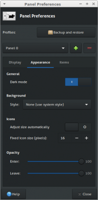
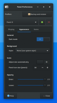
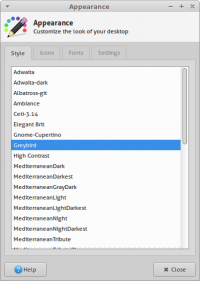
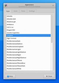
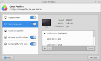
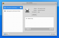
The screenshots always show the current style first, then the new style. The theme is Greybird, although some shots also contain Adwaita (in addition).
Preferences Dialogs (libxfce4ui aka XfceTitledDialog)
Panel Settings (Dark Mode enabled)
Appearance Settings
Color Profiles
Applications
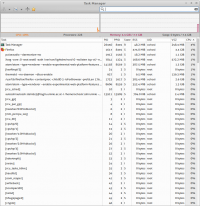
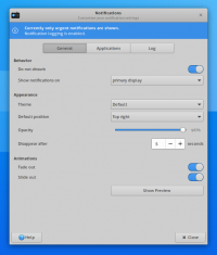
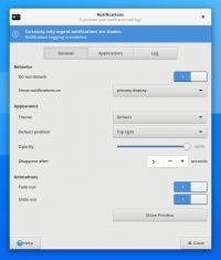
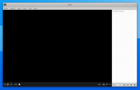
Three applications, one with a headerbar redesign (Taskmanager), one which is practically a settings dialog (Notifyd) and one with a minimal/zero-redesign CSD (Parole) to highlight different options/steps we have/can take when trying a transition.
Taskmanager
Notifyd
Parole
Relevant for Scenario 2. (Scenario 1 could e.g. mean dissolving the menubar into the headerbar somehow.)
